Awhile ago, my friend Tina taught a few of us how to make Explosion Boxes. You’ve seen them, an ornament sized box that once you remove the lid, its sides fall open and you have different pages to put your pictures on. My first attempt actually turned out pretty good. I made a box to memorialize one of our Disneyland Trips when the kids were smaller.
 |
| Side of box |
 |
| Box exploded! |
So my niece Teri, wanted explosion boxes made to hold her two children’s annual school pictures for their entire school careers (they are college and post-college now). I set to work. Since the box was going to cover all ages I needed the papers to be generic and not age specific and at first glance to show the difference between boy and girl. For Johanna’s box I chose papers that had purple, pink, olive green and pale yellow. I paired that with patterned papers from Cloud9Design the Brittany's Castle collection.
 |
| Outside of box. |
 |
| Inside with heart labels! |
Since my niece was the one who was going to be putting the pictures in the box and I didn’t know in which order she would put them, I wanted a way for Teri to be able to label each picture for the school year during which it was taken. Teri is not a scrapper…she is a seamstress. I wanted this to be easy for her, so I came up with the idea to print on matching cardstock the years of school, K through College, and punch them out in the shape of small hearts. In this way Teri could order the photos however she wanted in the box and just match the appropriate year and heart. To personalize them even more, I decided to make the top bear each of the kid’s names. If there was any question about whose box it was, it would be easily discernable. Well the finished product doesn’t have their names, but it bears their initials and while they both have the same initials, I think I’ve made them different enough for anyone to be able to tell which box is Johanna’s and which is Jameson’s.
 |
| Johanna's lid. |
 |
| Jameson's box. |
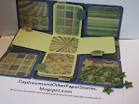
For Jameson's box I was struggling with knowing which papers to use. It's hard sometimes to find papers that can be used for guy projects that have some personality. While attending my recent kraft class, I found this paper pack that my friend Jayne suggested might work. I chose papers from Tim Holtz’s Retro Grunge pad in green patterns for the insides, blocks and tabs, and added a dark blue, a lighter green, and a brown shade for the layers of the box. For the top of his box I chose a star and I used his first, middle, and last initial in a simple font. I made the years of school on smaller stars, again so Teri can mount them on the appropriate picture. I loved this paper pad because it had some pages that had pre-sized squares in 6 x 6 and 2 x 2 inches and this allowed me to use some of the smaller pieces for tags to insert into the pockets. Here is a look at the inside.
 |
| Exploded box with stars! |
I have sent off both boxes to my neice. She received Johanna's a few weeks ago and loved it. This one she should be receiving in a day or two. I'm hoping she likes it just as much! It's been fun. I just might have to make a few more!
Thanks for stopping by. Imagine, create, enjoy!
PS: I love them both. I'll be filling them with pics as I go through photos for Jameson's scrapbook. Deb you are so awesome!!
ReplyDelete